In today’s competitive online marketplace, driving good traffic to your product pages is important to beat the competition within your niche.
Everyone knows this.
But how do you ensure your product pages rank higher in search engine results and stand out from the crowd?
The answer lies in effective product page SEO. .
Making use of some really good strategic and actionable seo tactics can actually give your product pages the push they need to rank higher in SERPs, make a mark within your target customers and at the end of the day boost your bottom line – SALES!.
Whether you are a seasoned ecommerce business owner or just getting started with your online store, this guide will equip you with the knowledge and tools to optimize your product pages for both users and search engines.
But before we get into the 13 strategies(which we have picked for today’s list) to stand out in the crowd , let us first take a holistic look at the elements that make up an ecommerce product page.
Let’s get started.
In online commerce, product pages are your shop window. They entice customers to step inside and explore. Therefore, having a well-designed and optimized product page is more important now(especially in this competitive market).
Having a good product page consists of a strategic layout and inclusion of essential elements to convert random browsers into paying customers through various touchpoints.
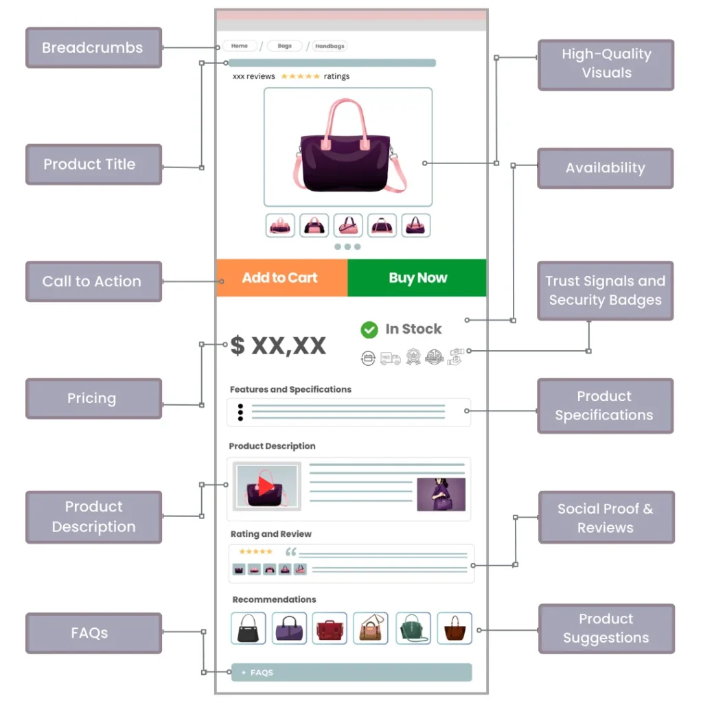
Product Title:
The product title is the first thing a visitor sees(apart from the image obviously). If that is so then it should be clear and descriptive, providing an immediate understanding of what the product is.
Product Specifications:
A short and crisp product specification helps the visitor take a quick glance about the details of your product. These pieces of information are extremely useful, so make sure they are precise and easy to read, best formatted as a bulleted list for quick reference.
High Quality Visuals:
The most important element of a product page, high-quality images and videos makes the product sell itself. Try multiple angles, zoom functionality, and 360-degree views to enhance the customer’s ability to inspect the product virtually.
Pricing and Availability:
Clear pricing information is important as it helps customers to make informed decisions. If provided then Include any discounts or special offers in this section. Make sure the availability status (in stock, out of stock, or backorder) is visible to manage customer expectations and reduce cart abandonment.
Product Suggestions and Recommendations:
Suggestions to related products acts as an upselling strategy and also it helps customers to view around your store inventory. So, personalize these recommendations based on browsing history or purchase patterns to make them more effective.
Call to Actions:
Your customer’s journey on your product page is in your hands. And CTAs are the answer to seamless navigations. Buttons like “Add to Cart” or “Buy Now” or “Wishlist” are essential for guiding customers towards making a purchase. These buttons should be easy to find, stand out on the page, and clearly indicate the next step.
Social Proofs and Reviews:
Social Proofs are like triggers to a customer’s black box. Reviews, images, ratings are elements that highly influence a person’s purchase decision. Displaying user-generated content and testimonials on your page will help you build trust, relevancy and validation about the quality of your product.
Trust Signals and Security Badges:
Trust signals such as security badges, return policy guarantees, and certifications reassure customers about the safety of their transaction.
Product Descriptions:
This section is your chance to boast the most about your product. State clear benefits, use cases, problems it solves, key features and all the other awesome things the customer can expect upon purchasing your product.
Breadcrumbs:
If you are in a new city you need a map to know where you are and from where you have come. This is the exact purpose of having proper clickable breadcrumbs on your product page. They help customers navigate easily giving them ease of purchase.
Frequently Asked Questions:
FAQs are a great way to address common questions your customers have regarding your product. Include questions asked by your customers and not framed by you. Answer to these questions in the language they understand better.
Now that we have discussed the elements that make up a good product page. It’s time we move on to discuss some strategies to make those pages perform even better.
Product pages are your digital sales force, convincing customers to add items to their carts and hit that coveted “buy” button. But with endless competition vying for attention, how can you ensure your product pages stand out and convert visitors into loyal customers?
Fear not, fellow entrepreneur! Here are 13 winning strategies to optimize your product pages and unlock their full conversion potential:
Search engines are your gateway to targeted traffic. Don’t miss out on it. Optimize your product pages with relevant keywords to ensure they rank high in search results. Conduct keyword research to identify terms your ideal customers are using to find similar products. Integrate these keywords naturally throughout your product titles, descriptions, and even image alt tags. Keyword stuffing is a big no-no – prioritize readability and user experience (UX).
Keyword research is a great deal. Targeting long tail low volume keywords are as important as targeting generic keywords with more volume. On one hand with low hanging keywords you will be targeting the users who are looking for a solution to a niche problem which you can provide(meaning that these keywords will bring you conversions). On another hand focusing on high volume keywords can fill your awareness stage funnel.
Intent-based keyword research should be the priority while doing keyword research. Whether your in-house team is doing or you are hiring Ecommerce SEO services, make sure to communicate with them and ask them to identify easy-to-win profitable keyword opportunities. The second most crucial thing is competitor research. Make a list of keywords that define the problem you are solving. Search all those keywords on Google and see the page’s ranking, competitors, and the type of results people interact with.
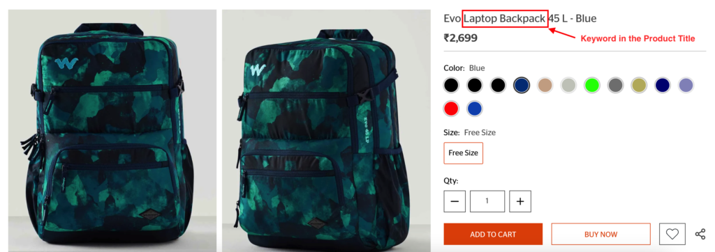
Image Credit - Wildcraft
Your product descriptions are mini-sales pitches. So, it pays to craft clear, concise, and engaging copy that highlights the features and benefits of your product. Explain how your product solves customer pain points and improves their lives. Use strong verbs, descriptive language, and emotional triggers to pique interest among customers.
When crafting your product descriptions, go beyond just listing features and benefits. Create content that appeals to your customers’ senses with vivid language that helps them imagine using the product. Structure your content in a scannable format with short paragraphs and subheadings for easy reading.
Frame your description as a solution to a problem, showing how your product addresses specific customer needs. While technical details are important, present them in a way that highlights their value to the user.
The goal here should be to provide the much needed information about the product in the most optimal way. While shopping online people cannot touch or feel the product or cannot have a demo on whether the product can actually solve the pain point. This definitely creates a bottleneck for many brands but creating good product descriptions can save the day for you.
Good detailed product descriptions and reviews from your customers can help new users trust your product making them more likely to buy from you too.
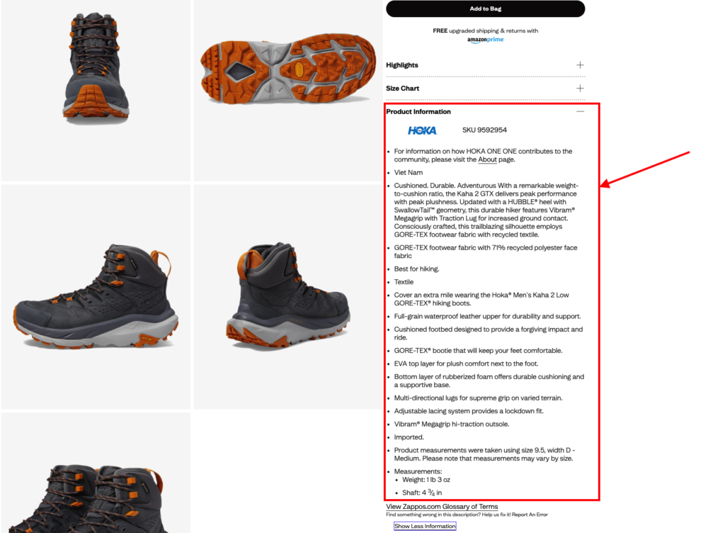
Image Credit - Zappos
85% of shoppers say that product information and images are important factors when choosing one brand over another. As we just discussed how to write compelling product information, now let’s see how product images have the potential to change the game for you.
For generations people have touched and felt the product they are buying before they make a decision. But with the arrival ecommerce has taken this sense away from buyers and they have also adapted to just watch, select and buy, no tryouts.
While as an ecommerce website owner you cannot give them the touch and feel experience but you can stimulate the same feeling though visualization. This is where the importance of using quality images of products lies. But it’s not an easy job to do as product photography is a skill to master and companies usually seek help from professionals to get the job done.
Uploading the pictures to your page is another checklist to follow. Here are some factors to keep in mind while including images in your product page:
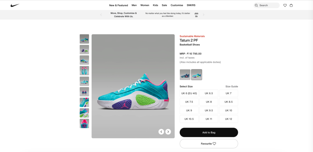
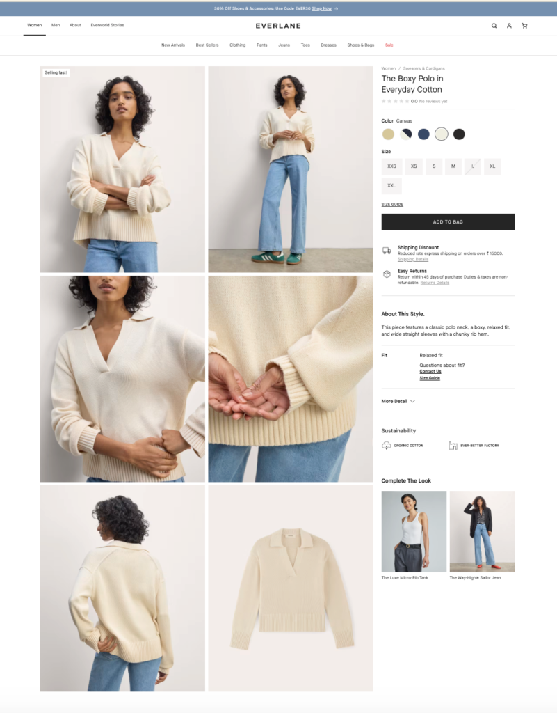
Image Credit - Nike & Everlane
Your product page layout represents how you want your user to navigate through the page. But before the user lands on your page, they need to find you first. On-page search engine optimization is the answer to that. SEO helps you make your product page rank high when customers are searching for keywords relevant to your business.
On-page SEO elements like title, meta and URLs are like the building blocks of your digital store, each playing a crucial role in both giving users a better experience and search engine a better visibility. Let’s see one by one how each element contributes to make your product page better optimized.
Your product title is often the first thing both search engines and customers see. Hence, always write a keyword-rich title that accurately describes your product and at the same time grabs attention. Use your H1 tag for the main product title, and structure your content with H2 and H3 tags to create a logical hierarchy within the page. Using subheaders helps the reader to skim through content. For example use h2 & h3 tags when writing major features. Moreover proper header tag implementation helps google crawl your page better and understand the content of your page for search relevancy.
Keep your URLs short, descriptive, and include your primary keyword. Avoid using numbers or symbols unless necessary. A clean URL structure not only looks more professional but also makes it easier for customers to remember and share your product page.
Download infographic on Top 8 Tips to Structure URLs for Ecommerce Websites.
Another major on-page seo element is keyword insertion. Although a very common and traditional practice, optimizing product pages with relevant keywords plays a huge contribution in your ranking parameters.
Once you have identified the relevant keywords, now it’s time to naturally and strategically place all over the page. Include your primary keyword in crucial places like the title tag, H1 header, first paragraph of your product description, and sprinkled naturally throughout the content.
Don’t forget about long-tail keywords – these more specific phrases can help you target customers with high purchase intent. However, always keep in mind that keyword usage should feel natural and not forced.
Use tools like Search Console or any third party tool to identify the actual keywords the particular page is ranking for. Look for both branded and non-branded terms. While doing this exercise you will find a lot of question related queries as well. Try to address questions in the FAQ section of the page.
Think of your meta description as a mini-advertisement for your product page. While it doesn’t directly impact rankings, a well-crafted meta description can significantly improve click-through rates from search results.
Meta description is 155 character page description that appears under the blue link search. Use this space to summarize your product’s key features or benefits, include a call-to-action, and make sure to incorporate your target keywords naturally.
Adding structured data markup to your product pages is like giving search engines a cheat sheet about your products. A schema markup or code helps Google understand key details of your products like price, availability, and ratings. When you use this markup, your products can show up in search results as rich snippets with detailed information.
To use structured data:
This extra step can help your products appear in more eye-catching ways in search results and mainly in Google Shopping. That means people can know about the pricing, description and other details of your product within the SERP itself. This upfront information to shoppers could make them more likely to click on your product page link.
Transparency is the key when it comes to optimizing product pages for your customers! Your product page should consist of clear, easily digestible information that answers all your customer’s potential questions before they even ask.
Start by displaying the product price prominently – no hiding or misleading tactics here. If you’re offering discounts, make them stand out and easy to understand. Don’t forget about those extra costs(if any); be upfront about taxes, shipping fees, or any subscription costs that might apply.
Now, let’s talk about availability. There’s nothing more frustrating for a customer than falling in love with a product only to find out it’s out of stock. Keep your inventory status up-to-date and visible. While you’re at it, give them a clear idea of when they can expect their purchase to arrive(shipping dates). Estimated delivery dates can be a make-or-break factor for many shoppers.
Another important thing to be clear about in the product page is the payment options. Whether it’s debit cards, credit cards, UPI, or even financing options for big-ticket items, let your customers know very clearly what payment options are available.
Be clear about your return policy from the very beginning and make the policy prominent in the product page and also on the checkout page. Having a clear return policy will help both the parties as customers will have a hassle free buying experience as they would know that you are flexible with returning products in exchange for full refund or have a product replacement policy in terms of defective products.
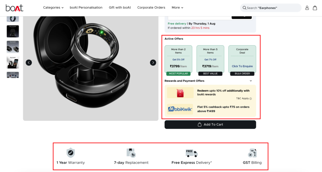
Image Credit - Boat Lifestyle
CTAs or Call To Actions means what next step you want your page visitors to take after they have landed on your product page. An ecommerce product page consists of many types of CTAs for example, a clear big “Buy Now” button, “Add to Cart” button, “Wishlist” button, etc.
These CTAs combine up to give a direction to your user and make a purchase decision. Optimisation of CTAs requires a combined effort of two different approaches. Let’s see each one.
Your “Buy Now” CTA button should be the first thing a user sees. Strategic placement of major CTA buttons plays a vital role here. For example, if you load your page and see that you have to scroll down to view the “Buy Now” button, then you might need a design change and bring that CTA up.
Test your page on multiple screen types to see the appearance of the CTA button. Make sure on every screen size, the button is placed right next to the product with a center alignment.
A product page consists of many elements, but CTA is the most important of them all. That’s why you have to make sure that the CTA actually stands out among all the other elements. How can you do this? It’s simple.
First of all keep the CTA button simple and clear, do not use any fancy words. Second, choose a different color or highlighting color for the button. You can also use high contrast colors that change whenever a user hovers over the button. Third, make sure there are no content or word clusters around the CTA button(that will make the button less visible).
Over all you have to make sure that you are giving the most hassle free and frictionless buying experience within your niche. Assess your competitors and see how much time does it take for an user to land on one of their product pages and purchase the item. See if you find any bottlenecks on their product page that you can remove from yours to make the purchasing journey a bit better.
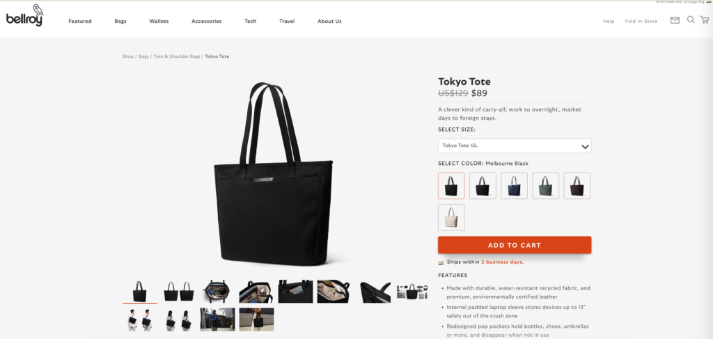
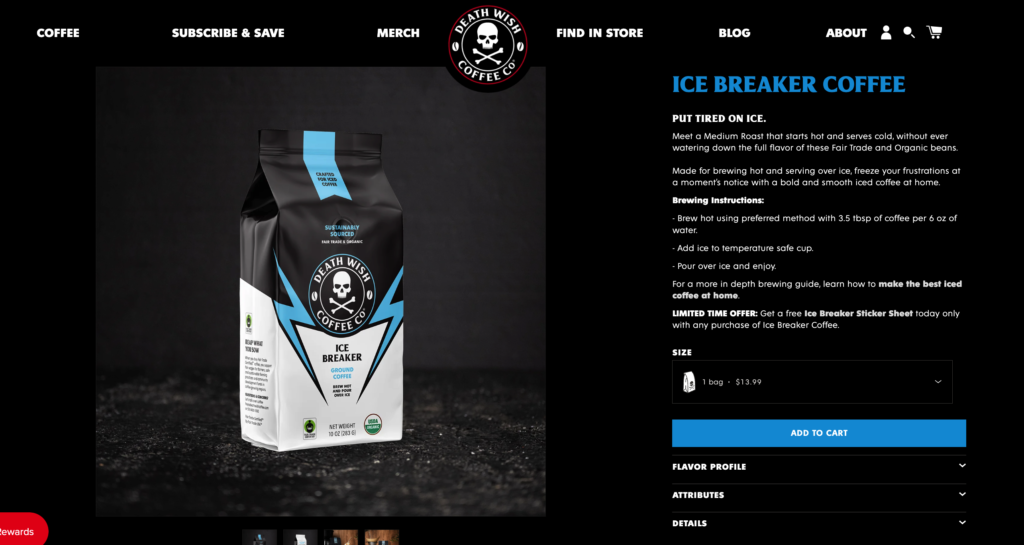
Image Credit - Bellroy & Death Wish Coffee
Customer reviews and ratings are like gold dust for your product pages. Over 95% of shoppers are reading these reviews before they even think about hitting that ‘Buy Now’ button. It’s simple – people trust other people, especially when it comes to buying something in exchange for their hard earned money.
So, how do you make the most of social proofs on your product page?
Start by prominently displaying star ratings right next to your product. It’s an instant visual cue that tells potential buyers, “Hey, others love this product!”. Showcase detailed testimonials from your happiest customers and tell the stories about how your product solved their problems or made their lives easier.
Remember every customer review or testimonial is a User Generated Content or UGC which is a great signal for search engines to make your page more relative, authoritative and trustworthy.
Now as on one hand positive reviews can really make a difference for your product, on the other hand negative reviews play a role in your product page. Yes, you read that right. A few less-than-stellar reviews can actually enhance credibility to your page.
It shows you’re not hiding anything and giving your new customers a first hand experience. . The key is in how you handle them. Respond promptly and professionally to negative feedback. Show potential customers that you’re committed to making things right. This level of customer service can turn skeptical users into loyal fans.
To streamline the activity of collecting UGCs, integrate a review platform that allows customers to upload photos or videos of your product in action. This user-generated content is marketing gold for you. It gives potential buyers a real-world look at your product, beyond your polished product photos.
Pay attention to what your customers are saying. Are they raving about a feature you didn’t think was that special? Highlight it! Are they consistently mentioning a small issue? Address it in your product description or FAQ section.
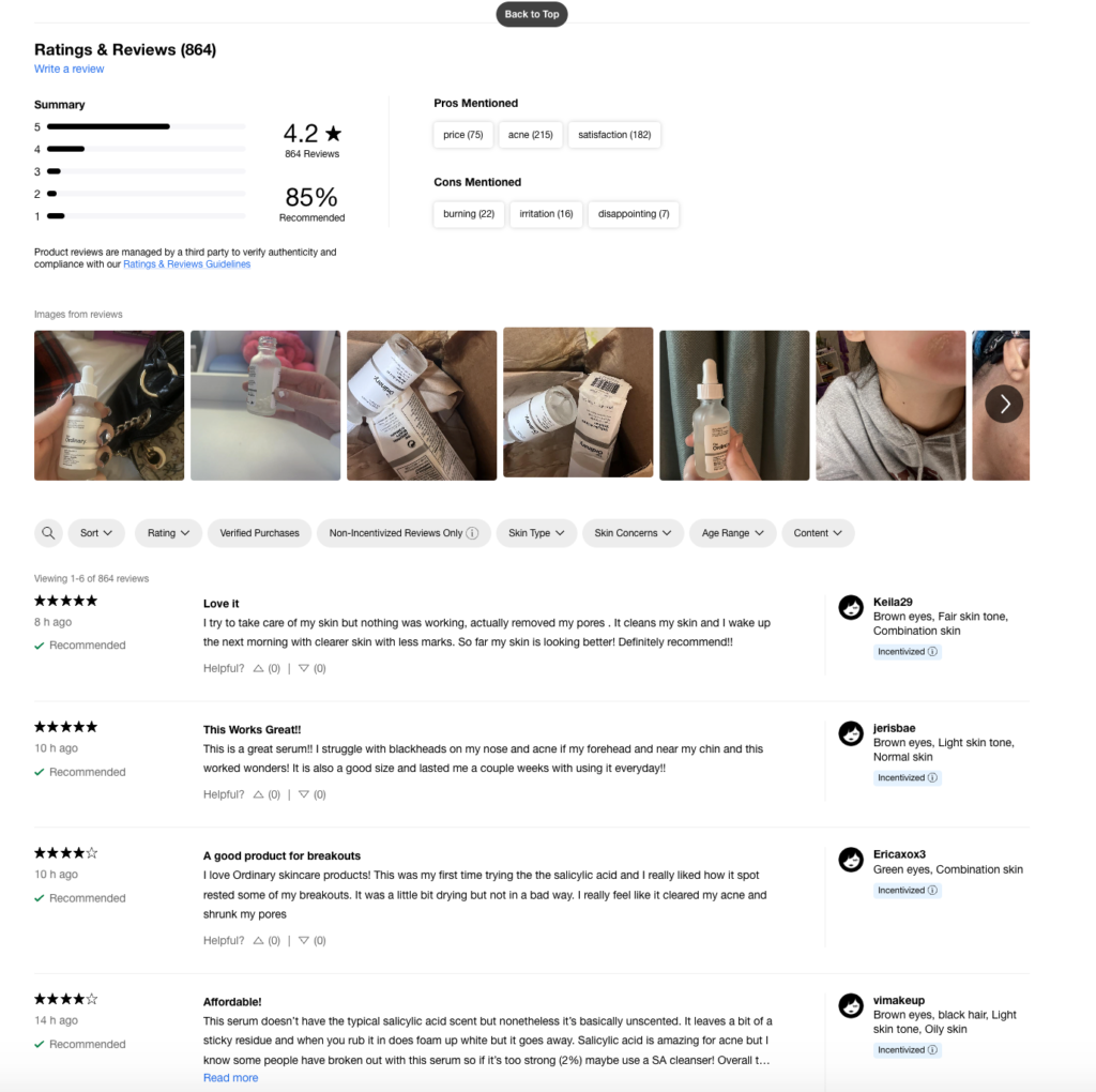
Image Credit - The Ordinary
Adding a “suggested products” section in a product pages is a smart move for any online store. This feature shows customers other items they might like based on what they’re already looking at.
The “suggested products” section can be set up in various ways, based on the activity of the user. You might show products that people often buy together, items similar to what the customer is viewing, or things that go well with the main product. For example, if you are an online jewelry seller and you have a product page for pendants, then chains of different styles and materials can be great product suggestions as both the products compliment each other.
The important thing is to make sure these suggestions make sense and are useful to the shopper. Don’t show too many suggestions which are not relevant to the landed product page. This can confuse the user and ultimately result in a drop off.
Having a suggested products section can increase how much time people spend in your online store. Customers also might find extra items they want to buy from this section, giving you the benefit of upselling and cross selling. It also makes shopping easier by helping customers to find related products quickly making them more likely to buy something.
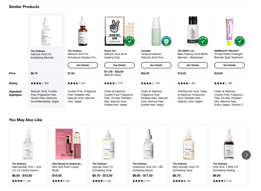
Image Credit - The Ordinary
Internal links are as important as backlinks to any website. Just like backlinks, internal links within your website creates a hierarchy based link juice transfer. That means with internal links you can streamline the link juice flow from high authority and traffic pages to lower authority pages.
For example, stronger pages on your site like homepage, category page, etc. have more authority in the eyes of Google. Therefore, internally linking these types of pages with your product page will boost the authority of the latter and help the page rank higher for relevant search terms.
Internal links send signals to google crawlers about how your webpages are structured and help them find newly introduced pages quickly. The better google bots crawl your website the better are your chances of getting visibility for targeted search terms.
Internal links establish relevance among pages within your website. Product pages are mainly commercial pages, but there might be other types of content pages(like informational) within your website on the same subject for example, blogs, product guides, technical guides, comparison pages, etc. Link these types of pages with the product page to create page clusters.
Page clusters make your product page more relevant for not only targeted search queries but related queries as well. Moreover, users can make use of these types of content to make informed purchase decisions. Ultimately, the goal is to become more authoritative in front of both Google and customers.
Another best case for internal links are using them to link related product pages to a particular product page. This helps the user navigate through the website better, stay for longer and might ultimately convert.
Internal links are a very useful tool for any ecommerce brand, but it has to be done strategically. When internally linking between pages make sure you choose the anchor text wisely. It should feel natural and direct to a relevant page.
Always link to pages with more traffic and higher PA and try not to keep any orphan pages within the website.
Nearly 60% of all ecommerce purchases globally are happening on smartphones. So when it comes to optimizing your product page for smaller screen sizes, there shall be no mistakes. When people are on their phone they prefer to go over things fast. Hence as an SEO you have to keep up with their pace or your competitor will.
There are certain elements which every SEO should keep in mind when optimizing their ecommerce product pages for mobile devices.
A. The product page should be easily viewable. This point might seem a bit obvious but there are product pages from websites, where you need to zoom in in order to read about what the product is, see images and read about other stuff like features, price, reviews,etc.
This is just a bad user experience. Always remember, SEO is what you do to make people find you but UI is what you do to serve a purpose for the people who are coming to your page(no matter the intent). So the moral of the point is make sure that your product elements have good visibility so that people don’t have to infinitely scroll to find important information like price and photos.
B. We have discussed earlier that buttons and CTA on a product page acts as the navigational assistant to the user. Make sure that when opened on a smaller screen size, these elements are properly displayed with large fonts and inverted colors(optional). Optimize the size of the CTA buttons to make sure they are clickable and responsive.
Placement of the button also makes a huge difference when your product page is being viewed on a smaller screen size. It’s always recommended to place the CTA button like “Add to Cart” or “Buy Now” above the fold, which means placing them on the first screen the page opens to so that the user doesn’t have to scroll down to find the next step of his action. This tactic can also help with your page conversions leading to higher sales figures.
C. Always make sure that your page loads fast, has a responsive design and gesture based functions. Use Google’s PageSpeedInsights to find out how much time your page is taking to load completely with all the images and other large elements.
Make your page gesture friendly so that people can easily zoom with pinch out to view images of the product more closely.
Breadcrumbs serve as a roadmap for your customers, showing them exactly where they are in your site’s hierarchy. But they’re not just user-friendly, they’re also search engine friendly. Google loves a well-structured website, and breadcrumbs are like a neatly wrapped present for their crawlers.
So, how do you make the most of your breadcrumbs? First, ensure they’re visible and easy to use. Place them near the top of your product pages, just below the header. Use clear, descriptive text that accurately represents your site structure.
For example, instead of “Category > Subcategory > Product”, try something like “Home > Women’s Clothing > Dresses > Summer Dresses > Floral Cotton Tee”.
Don’t forget to make your breadcrumbs clickable. Each level should be a link, allowing users to easily navigate back up your site’s hierarchy. This not only improves user experience but also helps distribute link equity throughout your site.
It’s very important that you implement schema markup for your breadcrumbs. This helps search engines understand your site structure better, potentially leading to those coveted rich snippets in search results.
Product variants can create a significant challenge for ecommerce SEO. When you have multiple pages for the same product with slight variations (like different colors or sizes), there are possibilities that your pages will face keyword cannibalisation. This occurs when several pages from your website compete for the same keywords in search engine results.
Canonicalisation is an effective solution to this problem. By implementing canonical tags, you can indicate to search engines which version of a product page should be considered the primary or “canonical” version.
Here’s how to implement canonicalisation for product variants:
<link rel=”canonical” href=”https://www.yourstore.com/products/main-product” />
For example, if you’re selling a t-shirt in multiple colors, your structure might look like this:
Main page: www.yourstore.com/products/classic-tshirt
Variant pages:
www.yourstore.com/products/classic-tshirt-red
www.yourstore.com/products/classic-tshirt-blue
www.yourstore.com/products/classic-tshirt-green
Each variant page would include the canonical tag pointing to the main page.
This approach helps consolidate your SEO value on one primary URL, preventing your pages from competing against each other in search results. It also helps search engines understand the relationship between your product variants.
While implementing canonicalisation, make sure that all your product pages offer a good user experience. Include clear options for customers to switch between variants, such as color or size selectors.
Canonicalisation is not limited to product variants. It’s also useful for handling URL parameters, such as those used for tracking or sorting, which can create duplicate content issues.
FAQs are not just a boring list of questions, but a secret weapon for your product pages to keep your user informed, engaged and knowledgeable before even they make a decision. The concept is pretty simple, just like you when your users are shopping online, they always have a few questions about the product.
For example, how to use it, how to maintain it, and the list goes on and on. That’s where FAQs come in handy. But, how do you make the most of FAQs on your product pages? Here’s how –
First off, listen to your customers. What are they always asking about? Scroll through those customer service emails, product reviews, and social media comments(social listening). That’s where you’ll find the questions people really want answers to. .
Now, when you’re writing these FAQs, keep it real. Use the same language your customers do. If they’re asking “How do I wash this thing?” don’t answer with “Garment care instructions include…” Just tell them straight: “Toss it in the washing machine, cold water, gentle cycle. Easy!”
Keep your answers short and sweet. Nobody wants to read an essay when they’re trying to buy something. If you need to go into detail, link to a separate dedicated page that talks about the product in detail.
FAQs are also considered as SEO goldmines. With FAQs you can catch those long-tail queries your target audience are searching for.
Writing FAQs in ecommerce product pages is not a one time activity, so don’t set it and forget it. As your product changes or new questions come up, update your FAQs. It shows you’re on top of things and care about keeping customers in the loop.
Where should you put these FAQs? After your main product description is a good spot. Use those dropdown things (you know, accordions) to keep it tidy, especially on mobile.
One last thing – use a FAQ schema markup. Schema markups help search engines understand your FAQs and you might even get featured on rich snippets in search results.
Remember, writing good FAQs are more than just answering questions. They build trust, help with doubts, and push people towards hitting that ‘Buy Now’ button.
Your product pages are like your digital sales team – working 24/7 to convince shoppers to hit that ‘Buy Now’ button. But in the highly competitive and over crowded market of ecommerce, it’s not enough to just exist. You’ve got to stand out, sparkle, and compel those potential customers.
These 13 strategies aren’t just some magic beans – they’re your secret sauce for cooking up product pages that’ll make both Google and your customers love your online store.
So roll up those sleeves, dive in, and start optimizing. In case you need any help with all these tedious optimisation tasks for your ecommerce brand, we are just one click away.

Consider optimizing product titles with relevant keywords and including them naturally throughout the page. Use long tail keywords in your content. Use internal linking to connect your product pages to relevant categories and blog posts. Ensure mobile-friendliness and fast loading times.
Research relevant keywords your target audience uses and incorporate them naturally. Focus on long-tail keywords that are more specific to your product. Prioritize readability – keyword stuffing hurts SEO and user experience.
Absolutely! Optimize image file sizes for faster loading. Include relevant keywords in image alt tags to improve search visibility.
Focus on detailed descriptions highlighting features and benefits. Use social proof like awards or certifications to build trust.
No! Duplicate content hurts SEO. Craft unique descriptions that showcase your brand voice and target audience.
Google Search Console offers free insights into your website’s SEO health. Keyword research tools like Google Keyword Planner can help identify relevant keywords.
Include natural language questions in your descriptions, for example, “How does this product help with…?”
Avoid keyword stuffing, broken links, and slow loading times. Do not neglect mobile optimization and prioritize a seamless user experience.
